Hi – Not sure how far along you are, and whether this constitutes a near-done or very rough draft? My comments may be annoying if this is super-rough… because you may very well be planning all that I am about to say! But here goes, and apologies if I’m behind your curve…
How to use:
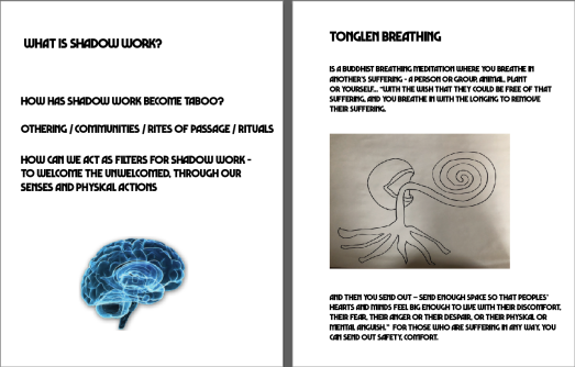
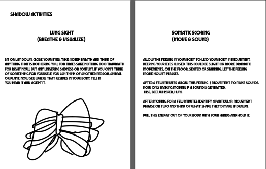
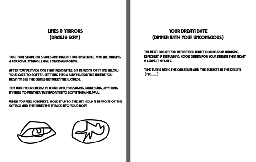
Can you set the setting? What are ways to use this information? are there ideal conditions or ways to embody this?
Map appears thin (and confusing) to me – as it’s so large, and could be an opportunity. For one, it could have more information or suggestive material. It also seems informationally flat and doesn’t aid me in understanding your field guide in a systemic way. I can explain this in person far more suggestively if you like.
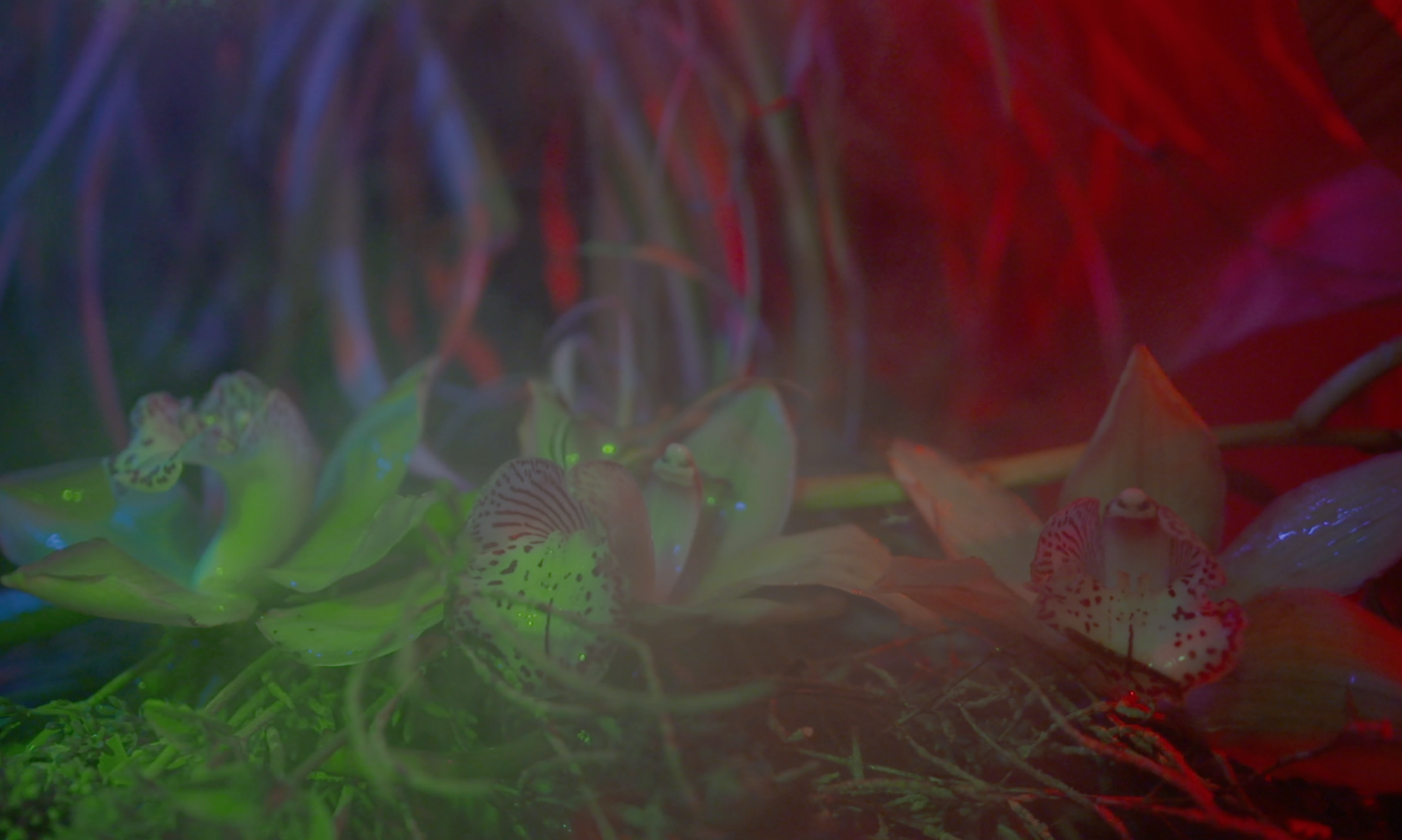
Are you planning to tighten up the graphical language? You have some hand-drawn icons, a color image, a scan of a pen drawn image – is this deliberately “scattered” visually?
The overall hierarchy:
As the images feel like you are using too many visual languages without motivating their use, the typography is almost all the same. There are no clear levels of information (titles, body text) and the pages are very much in the language of old school home zines. The page could be carved out in so many ways, using columns or parts of pages to good effect.


Hi – Not sure how far along you are, and whether this constitutes a near-done or very rough draft? My comments may be annoying if this is super-rough… because you may very well be planning all that I am about to say! But here goes, and apologies if I’m behind your curve…
How to use:
Can you set the setting? What are ways to use this information? are there ideal conditions or ways to embody this?
Map appears thin (and confusing) to me – as it’s so large, and could be an opportunity. For one, it could have more information or suggestive material. It also seems informationally flat and doesn’t aid me in understanding your field guide in a systemic way. I can explain this in person far more suggestively if you like.
Are you planning to tighten up the graphical language? You have some hand-drawn icons, a color image, a scan of a pen drawn image – is this deliberately “scattered” visually?
The overall hierarchy:
As the images feel like you are using too many visual languages without motivating their use, the typography is almost all the same. There are no clear levels of information (titles, body text) and the pages are very much in the language of old school home zines. The page could be carved out in so many ways, using columns or parts of pages to good effect.
LikeLike